BASIC DATA MINING DEMOS
offers some discussion on the pitfalls and tricks in statistical computing and inference in data mining, many examples from Dr George Wilson, MITRE/Georgetown.
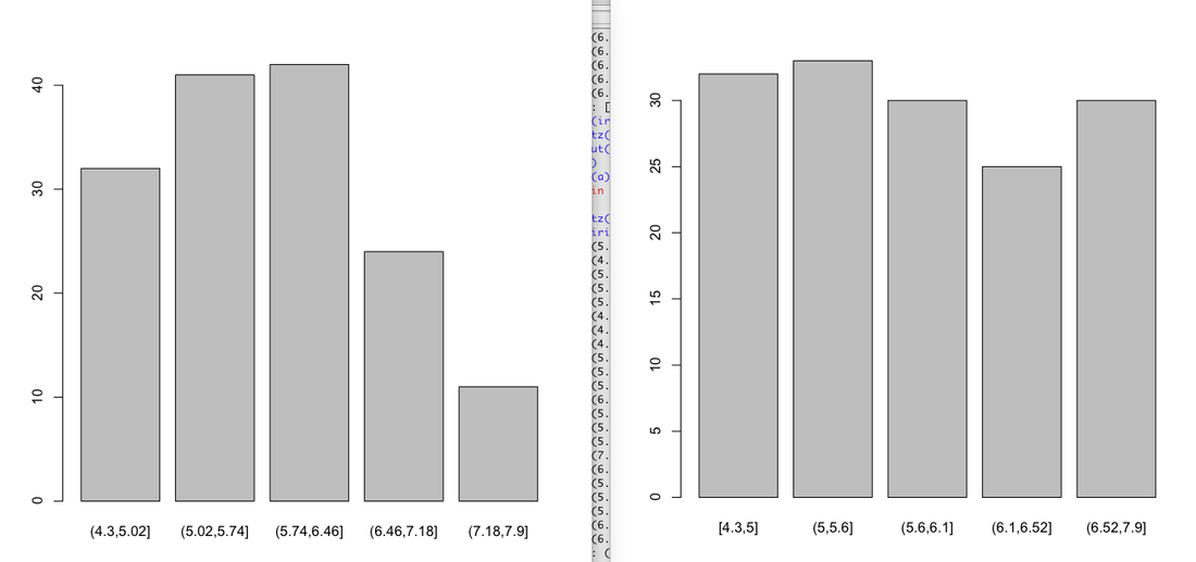
Equal width vs. equal depth bining(unsupervised bining)
see a reference here | data-mining-map
here we explore the two methods in R with iris data. (left: Equal width, right: equal depth)
bins=5
#equal width
quartz()
b<-cut(iris$Sepal.Length,breaks=bins)
plot(b)
#equal depth
quartz()
a<-cut(iris$Sepal.Length,include.lowest=TRUE,breaks=quantile(iris$Sepal.Length,probs=seq(0,1,1/bins)))
plot(a)
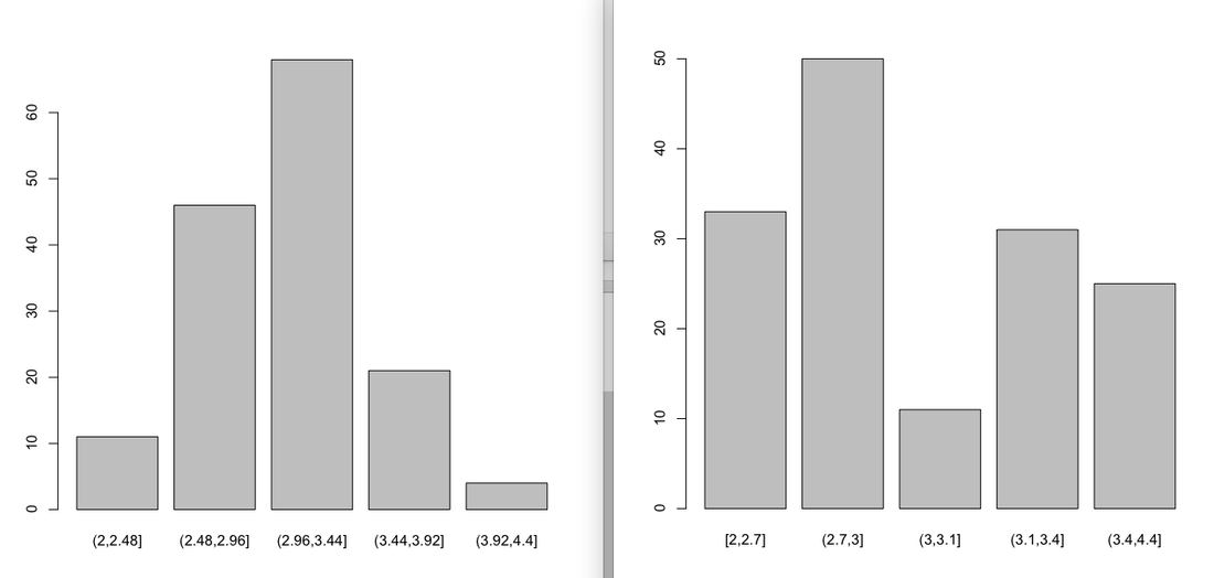
Same things with sepal.width:
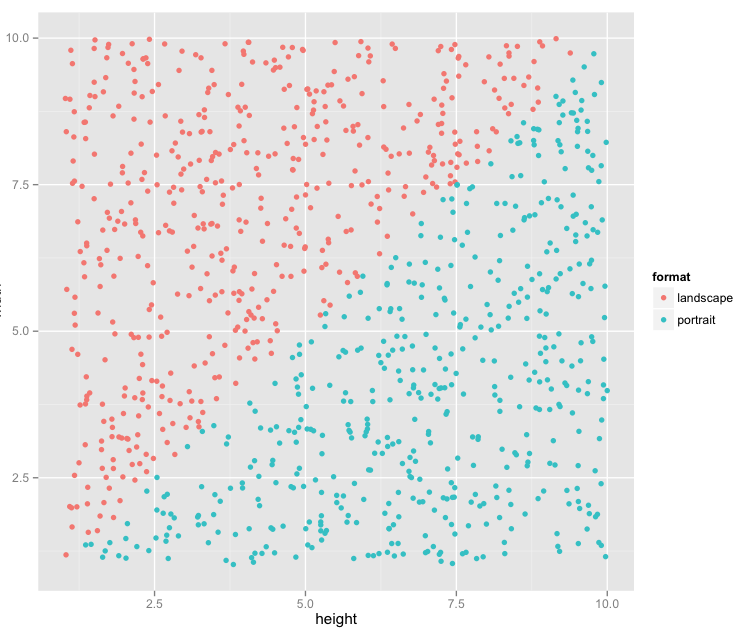
constructing PortLand Data
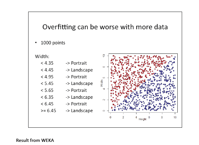
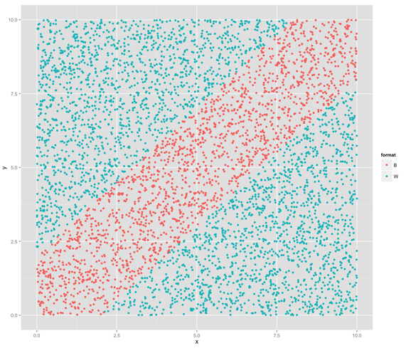
This is an example from Dr Wilson. We constructed this data, we know it well, and we can see how different algorithms perform to classify this data.
#create the PortLand data
library(ggplot2)
width<- runif(1000,1,10)
height<- runif(1000,1,10)
rec<-data.frame(height,width)
rec$format<-rep("landscape",1000)
"portrait"->rec[rec$height>rec$width,]$format
quartz()
recplot<-ggplot(rec,aes(height,width,colour=format))
recplot+geom_point()
|
|
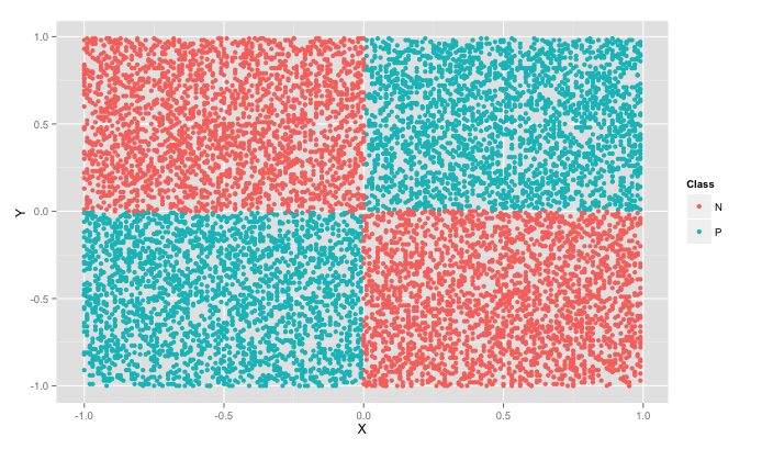
POS-NEG data (with PN10K.csv)
> pn=read.csv(file.choose())
> pnplot<-ggplot(pn,aes(X,Y,colour=Class))
> pnplot+geom_point()
> pnplot<-ggplot(pn,aes(X,Y,colour=Class))
> pnplot+geom_point()
blue-white data:x-2<y<x+2(Blue),otherwise(White)
library(ggplot2)
x<- runif(5000,0,10)
y<- runif(5000,0,10)
rec<-data.frame(x,y)
rec$format<-rep("W",1000)
"B"->rec[(rec$x-2<rec$y) & (rec$y<rec$x+2),]$format
recplot<-ggplot(rec,aes(x,y,colour=format))
recplot+geom_point()
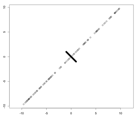
pitfalls of correlation(90% of this data is y=-x)
x=c(runif(100,-‐10,10),runif(900,-‐1,1))
y=c(x[1:100],-‐x[101:1000])
plot(x,y,asp=1)
cor.test(x,y)
Pearson's product-moment correlation
data: x and y
t = 51.7997, df = 998, p-value < 2.2e-16
alternative hypothesis: true correlation is not equal to 0
95 percent confidence interval:
0.8360068 0.8697146
sample estimates:
cor
0.8537527
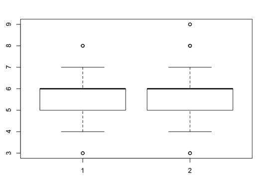
Is quality judgement different between red and white wine? (tricky)
we got the following judgment statistic:, they look almost exactly the same. (quality scale from 1-9). Look at boxplots to confirm this.
> summary(RW$quality) |
|
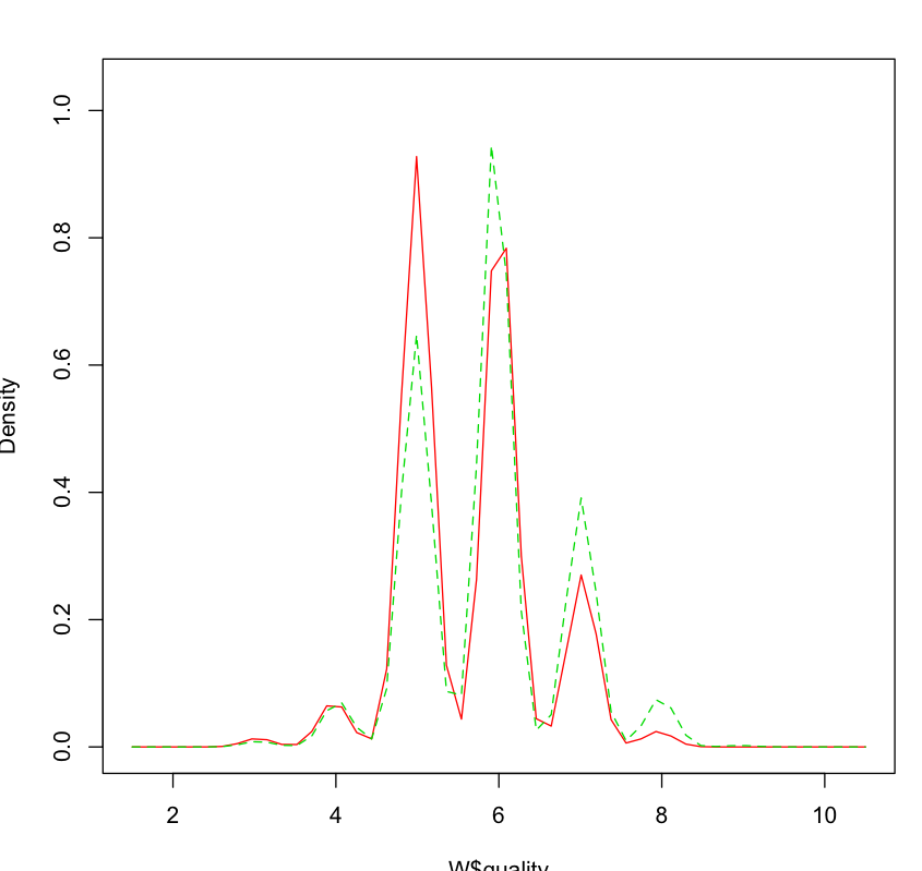
but this is misleading, bc it doesn't show anything about the internal distribution. t-test says it's unlikely they're the same:, and the density plot shows that the white wine had much more of good ratings (>6) than red wines.
> t.test(RW$quality, WW$quality) |
|
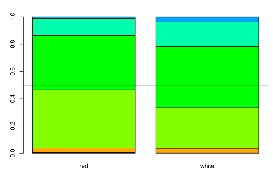
stacked barplot confirms what happened in the boxplots that hides the true difference: just because the first and third quartile have equal score, doesn't mean they are equally close to the next threshold of score, and it tells nothing about the actual distribution:
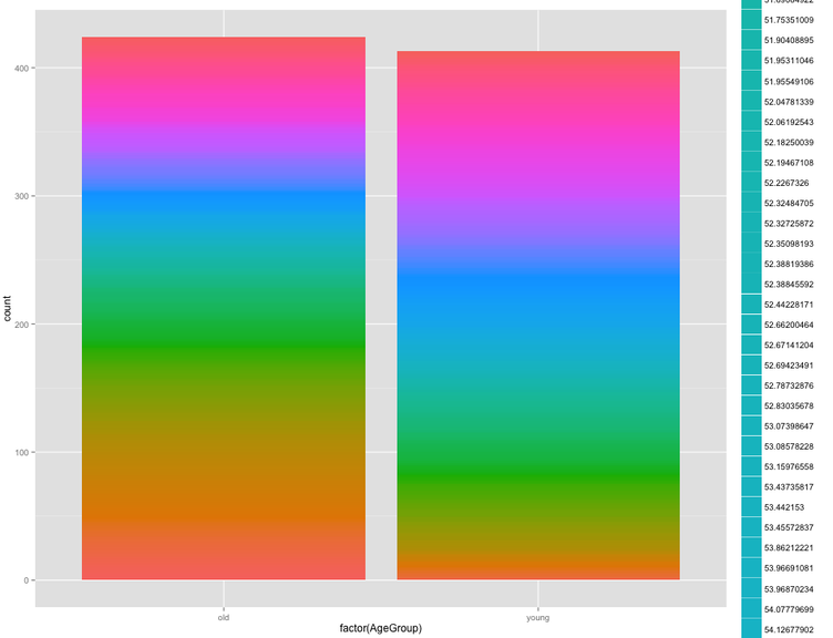
stacked plot on continuous variable
#you can see in the most direct way the distribution across quantiles in the entire dataset
>qplot(factor(AgeGroup), data=vot, geom="bar", fill=factor(vot_ms))