Codar data by town:histogram,density plot,box plot
Here we explore a number of different ways to visualize this data. Some ways are more efficient than others. This data comes from Dr Jennifer Nycz, Georgetown University.
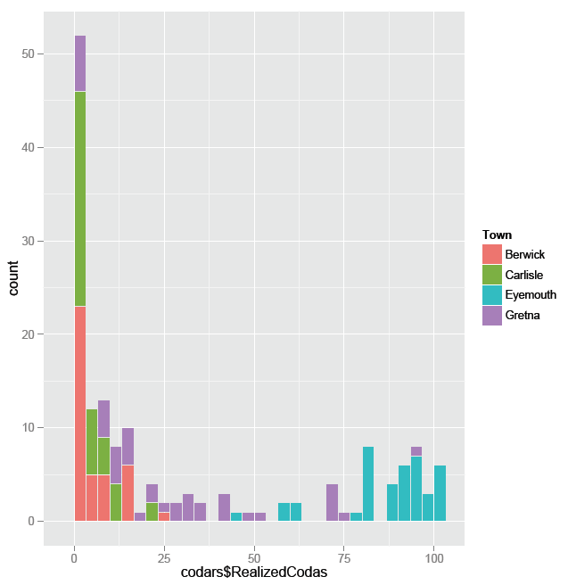
#one stacked histogram, color coded
>realizedCodasHistogram + geom_histogram(aes(fill=Town))
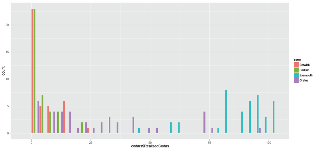
#one side-by-side histogram,color coded
> realizedCodasHistogram + geom_histogram(aes(fill=Town),position="dodge")
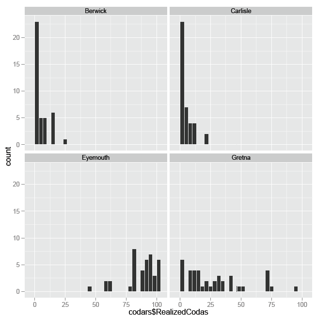
#four histograms, side-by-side (by four towns)
>realizedCodasHistogram + geom_histogram()+facet_wrap(~Town,ncol=2)
#in R plot(): setting par(mfrow=c(2,2))
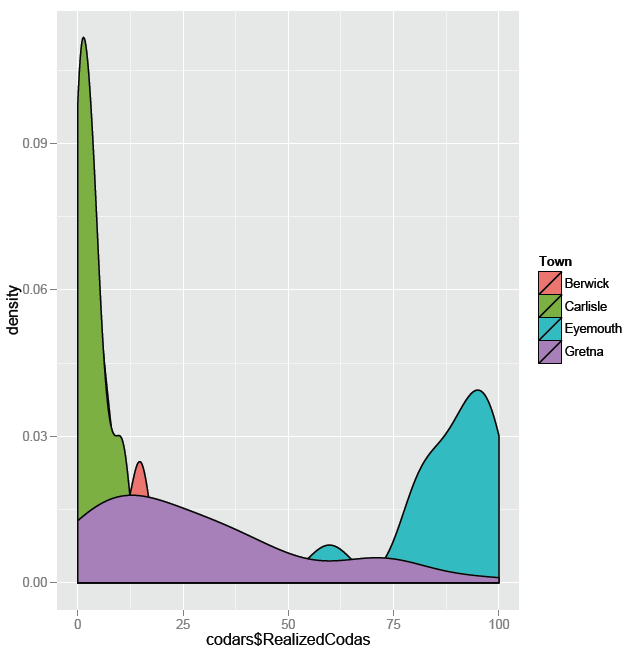
#one density plot, color coded
#if you compare this one with the next, you'll see how much data this one actually concealed
> realizedCodaByTownDensity + geom_density(aes(fill=Town))
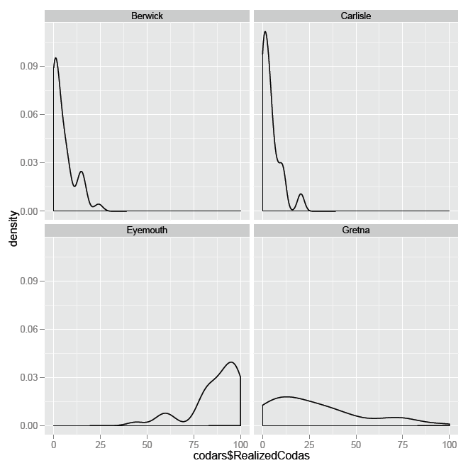
#side-by-side density plots
> realizedCodaByTownDensity + geom_density()+facet_wrap(~Town,ncol=2)
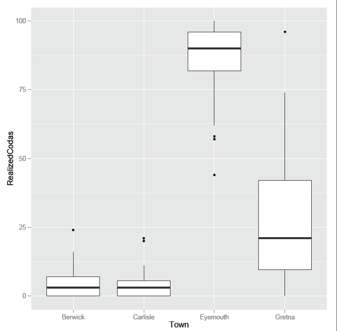
> RealizedBoxplot<-ggplot(codars,aes(Town,RealizedCodas))
> RealizedBoxplot + geom_boxplot()